Prescrip
Simplifying E - Prescriptions for Doctors
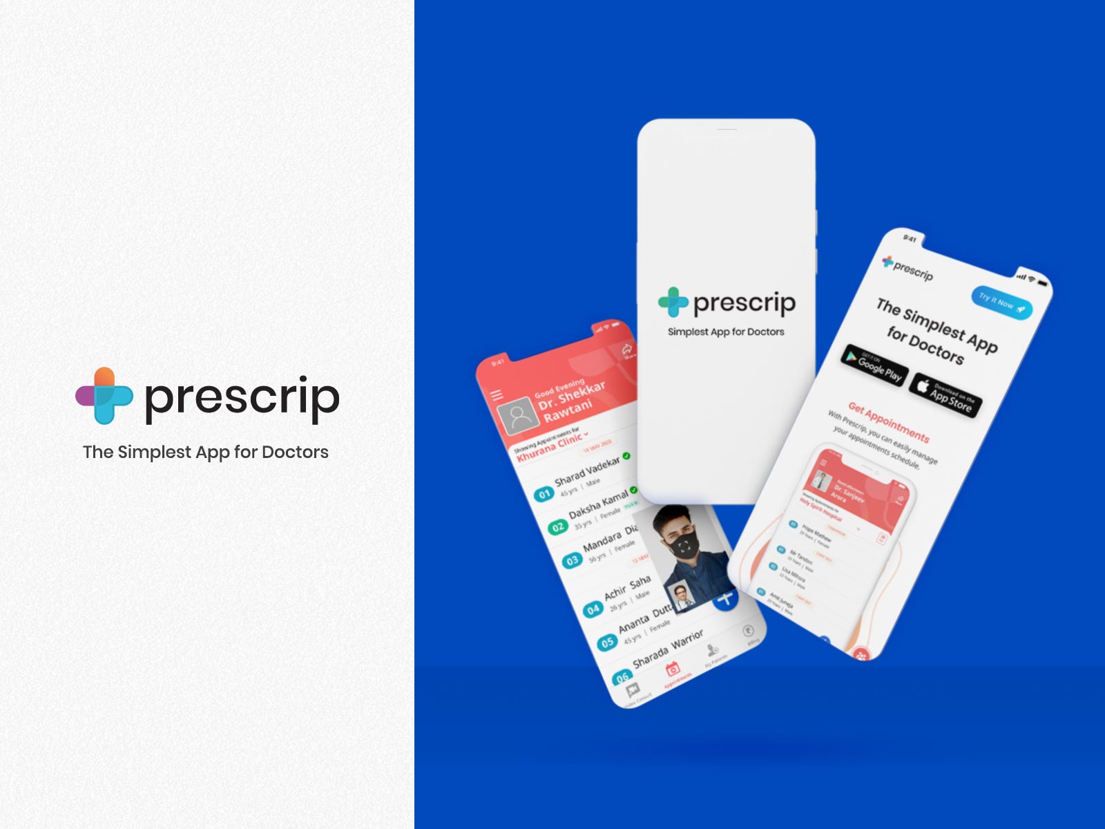
Prescrip is designed to enable you to print your prescriptions and maintain patient records with absolute ease(No Typing/No Writing Required). - Apple App Store / Google Playstore
Since 2014, Prescrip has been digitizing the medical prescriptions with E - Prescriptions, while keeping the process simple for Doctors and Medical Practitioners across the globe. With time Prescrip has evolved into an Electronic Health Recorder (EHR), that helps in recording patient details and investigations, also processing payment and scheduling appointments over the internet. It’s available on multiple platforms like Android, IOS and Web.
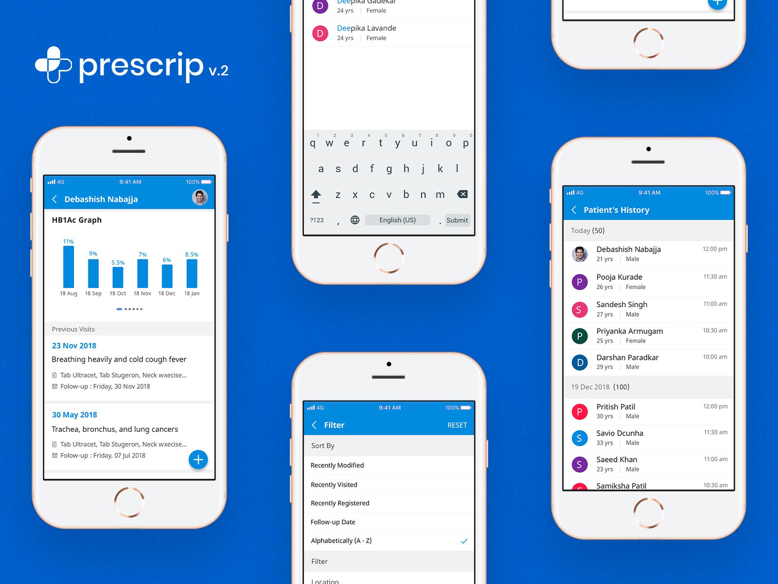
My Role and Responsibility
My role was for primarily an User Interface Designer and an User Experience Designer secondarily for the Application and Web front.
Building a Design System
Creating a basic Design System that comprise of colour palette, typography and component, to established the principles for Interface, along with Hi-Fidelity Prototypes to bring the vision into existence.
Research & Competitor Analysis
Referring the existing analytics, basic researches were carried out for certain process, like onboarding, appointments scheduling, billing, etc, as competitor EHR Apps were not accessible publicly.
Collaboration
Collaborating with the Stakeholders, Business Analysists and with fellow designer colleagues to give this product a new identity and voice.
Let’s Kick-off
The Process
Applying the Principles of Design Thinking, hence a solution-focused approach, applying the 5-stage model,
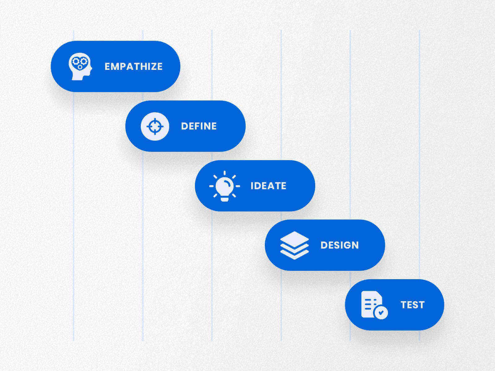
Empathize with Problems
Being a EHR it’s a suite of multiple services, we needed to ensure that the interactions do not overwhelm the user. With the team we identified following problems.
It’s Aging
“What’s dangerous is not to evolve.” ― Jeff Bezos
In the initial phase the app followed Material Design Principles, which has aged well with time. Following a new existing Design System might solve, but will surely age.
Bloated Journeys
A mindful revisit through the journeys such as onboarding & appointment scheduling, made us realize how bloated the paths were, which tamed the experience.
Too Monotonous
The app used a single blue colour for accents along with white colour for the background for the Interface, which left no traceable cues of progress, making the journey feel like a never ending tunnel.
Define the Core Principles
With the necessary insights in hand, with research and analysis the team built a mantra of ‘Simple’, the following steps were to be worked around this mantra.

Building Design System
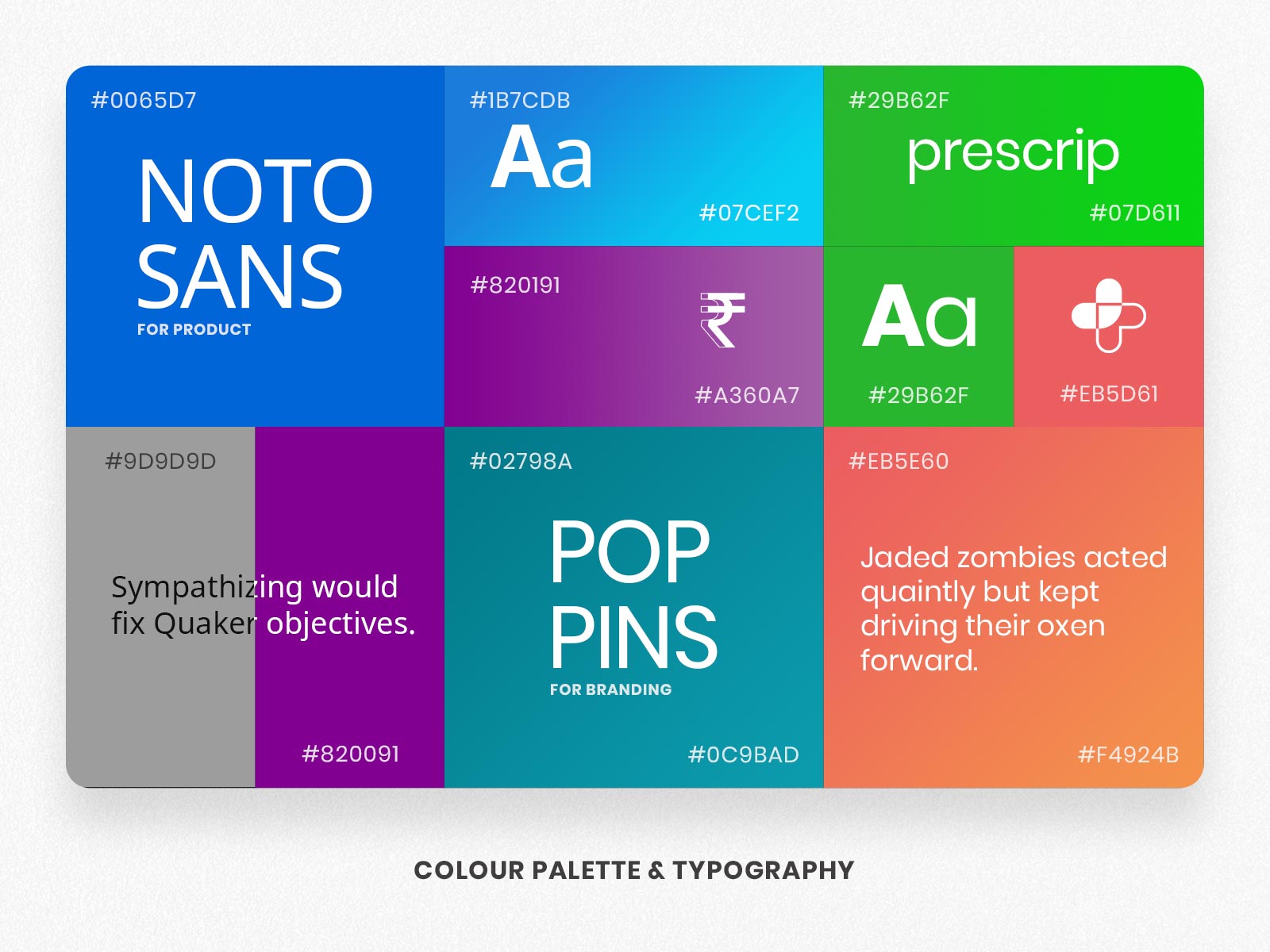
Using a fresh colour palette with sufficient typography, building interfaces with friendly curves and wide breathing space, being simple on eyes and to use. This system was the fundamental piece towards a consistent and coherent outcome during the collaboration.
Establishing Patterns
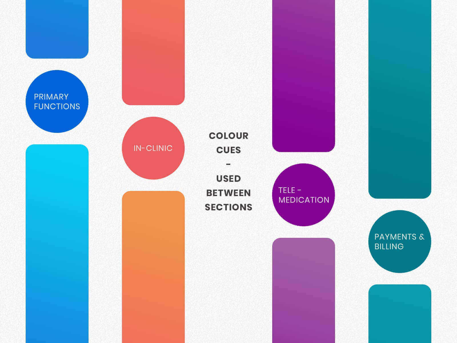
Building a pattern in every journey, so once the user notices it, user will never have to relearn it every time. Adding in identifiable cues such as colour cues also makes usability easier on-the-go.
Ideating
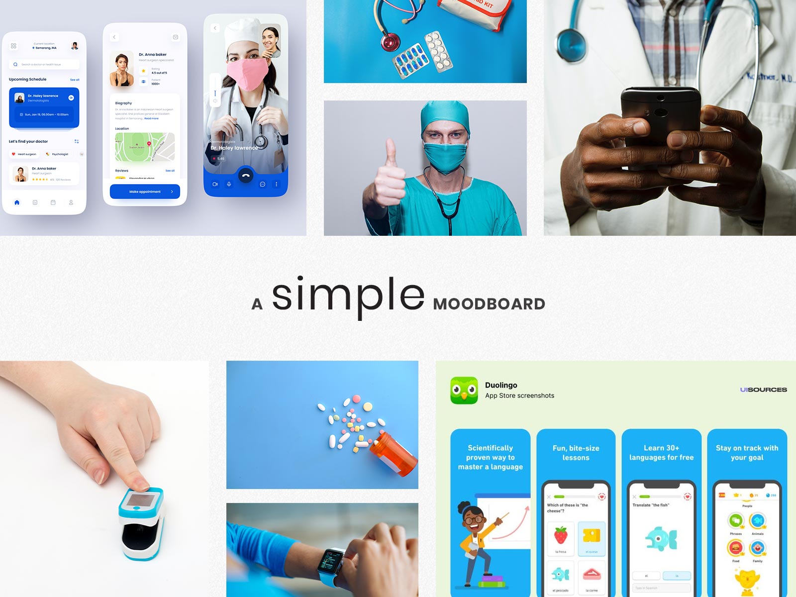
Scribbling the ideas and creating a moodboard around the mantra of ‘Simple’.
Designing
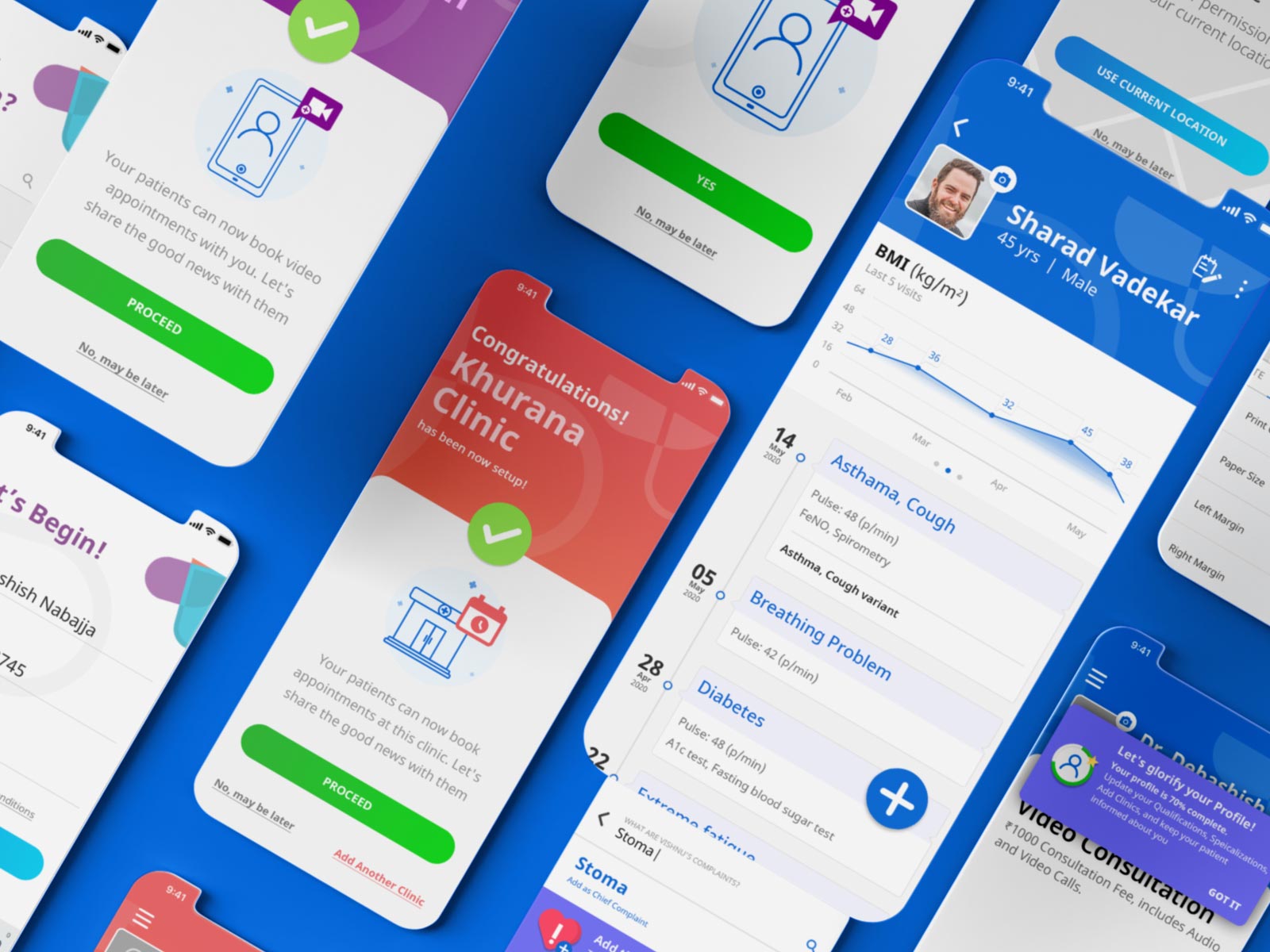
With the ground knowledge and ideas established, proceeded to create Hi - Fidelity Prototypes sticking to the established Design System.
The Product (App)
This product was the basis, around which the business revolves, therefore I had to put my best foot forward to make the visualized ideas to screens adding illustrations and motion graphics that can be interacted and brought under an icon of ‘Prescrip’.
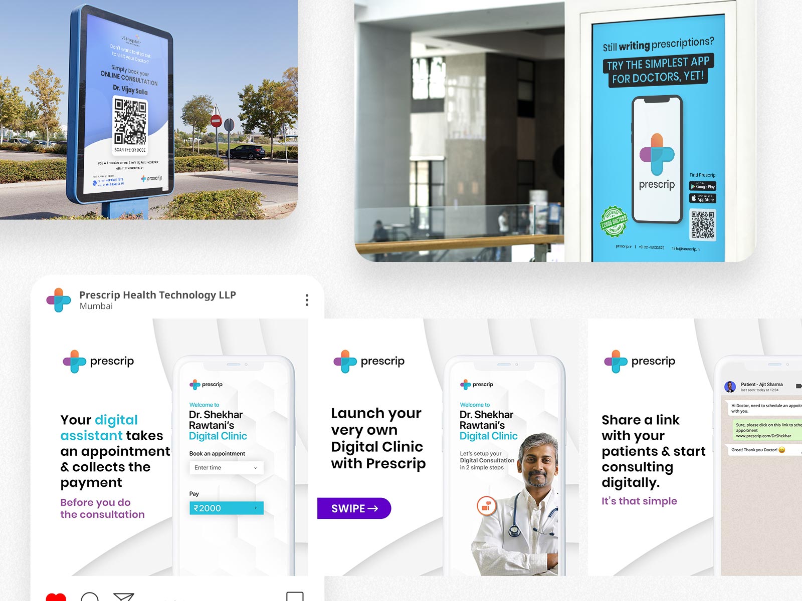
Social Branding
With a new ideology there should be a celebration for it and spread the word. I also provided my skills for the branding and marketing, in collaboration with the marketing team of Prescrip.
To Conclude
Usability Testing
A beta build was made available through installable format and through alternative App Stores for testing. These tests were handled by the high level stakeholders through face to face and online meetings. They participants appreciated the new interface and provided some valuable suggestions, those are as follows:
- The billing interface was needed to be condensed, for providing more information on-the-go.
- The Notes feature was very handy and required at every stage.
- In Appointment Scheduling, the Clinic Profile should be able to display images and warnings to the patients.
My Learnings
This project was a major challenge in my career. Working remotely while being in touch with the stakeholders, has thought me a lot, over time. Learnt about the inner and outer working of Doctors, the challenges they faced in their daily lives regarding maintaining patient records. This project started as an Interface overhaul, but through the journey, UX was also taken care of. This app is a humble effort towards making lives easier.
Thank you for reading till here…
Would you like to see another project of mine, named Anand Chulani?